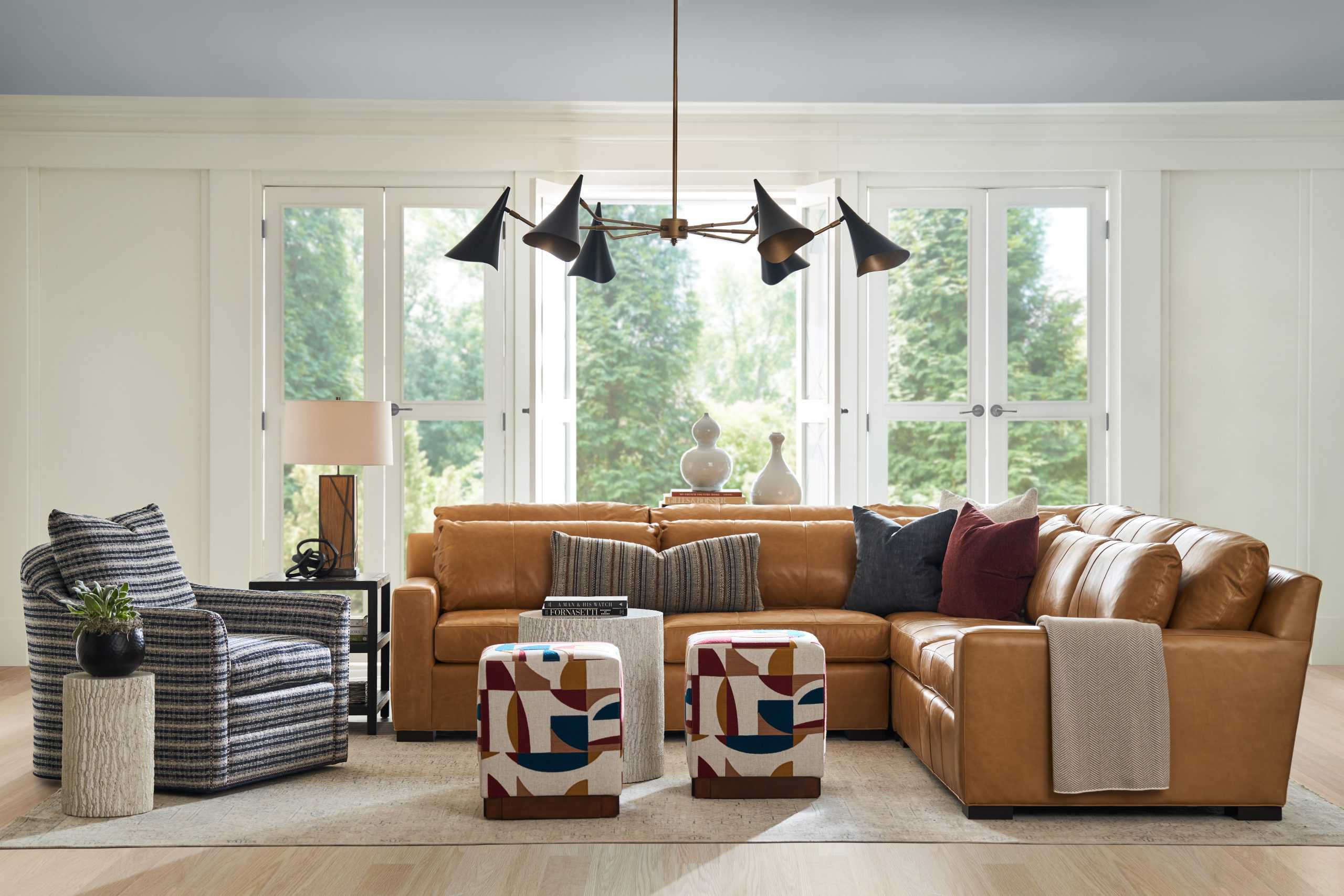
Why should walls get all the attention, leaving the ceiling as an afterthought? The fifth wall, as it’s sometimes referred to in the world of interiors, offers an entire world of creative possibilities when it comes to the design of your home. Read along for some of the inspired ways you can show some love to your ceiling beyond removing the dreaded popcorn.
Colour drenching
This method of painting all walls, trim, doors, and ceiling (and sometimes even furniture) in the same (or very similar) shade is known as colour drenching. It’s become increasingly popular over the several years as the design climate has shifted away from quiet, whitewashed minimalism toward bold, all encompassing colour schemes.

Colour drenching is not for those who are unsure of their colour choices. It’s for those who are confident in their design point of view and want to go all in on a specific colour scheme. This style of decorating works especially well in older homes that have wood panelling or interesting trim detail (this adds texture and visual interest), but can be incorporated into more contemporary spaces as well.

Because your entire room is going to be literally covered in the same shade, you’ll need to be sure you find your coordinating fabrics, furniture, and decor before you commit to a paint colour. This is generally a best practice you should follow before painting anyway, but especially important when colour drenching.
If you go for a totally monochromatic colour scheme where the furniture is also the same shade as your paint, texture will be absolutely key to creating a dynamic and rich design scheme.
Contrasting or tonal paint colour
If colour drenching is not your thing, it doesn’t mean you have to go with the standard white ceiling. Using an accent colour overhead can make your room feel incredibly bespoke and chic. For a subtle look, go a few shades lighter than your wall colour. For a dramatic statement, choose a darker shade or something completely different than the walls.

This technique can be a gentle introduction to incorporating the fifth wall into your design scheme as even a very subtle paint colour can have an overall big impact on the space. The commitment factor is also fairly low – if you don’t like it, repainting is relatively easy and cost effective.

If you’re a history lover, here’s an interesting fact: painting the ceiling of porches a soft blue-green has been a tradition in the Southern United States since the 18th century, beginning as a practice by West African Slaves to deter “haints”, or ghosts from entering the home. The idea was that the haints would be tricked into thinking the ceiling was either the sky water. Indigo, which was commonly grown on plantations, was originally used to create the blue dye to paint the ceilings, as well as blue bottles to further trap unwanted spirits. Haint Blue is still used on porch ceilings today across some parts of the South.

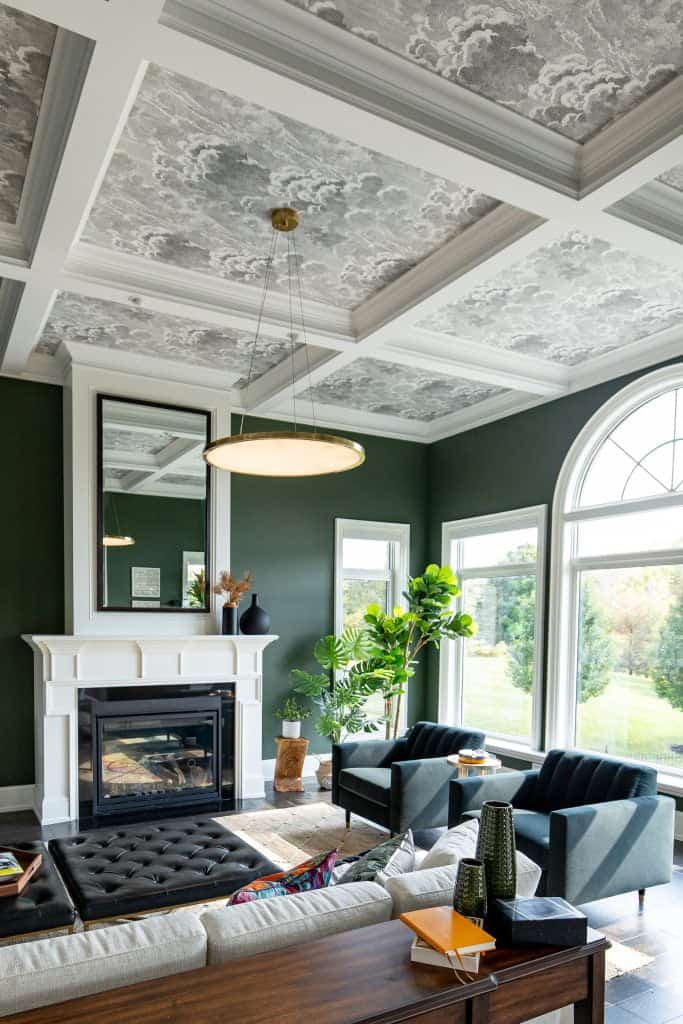
Colour Capping
Colour capping is a technique using tonal shades from the same colour family on the lower, mid/upper walls or crown, and ceiling. Two to three shades are used, going from lightest at the base, a mid tone on the upper wall and/or crown, followed by the darkest on the ceiling – creating a dynamic gradient effect. Think of it like the master’s degree equivalent to colour drenching, requiring a keen eye for colour combinations in order to keep this look sophisticated as opposed to chaotic.

Because this treatment draws the eye upward, it can actually make your space look bigger – a bonus for most of us. Like colour drenching, colour capping can be a fabulous choice in older homes with ornate mouldings and architectural details, as it highlights their beauty and provides visual interest and texture to the space.

Wallpaper
Our undying love of wallpaper doesn’t stop at vertical surfaces – it of course, extends to the ceiling. Just like a paint colour, this can either produce a bold statement or a soft and subtle aura in your space.
Wallpapering a ceiling is a surefire way to give your home an immersive and bespoke quality, adding depth, dimension, and character. Subtle options include natural materials such as grasscloth, hemp, and silk (or vinyl versions of these), creating the feeling of a room wrapped in warmth.
For a hit of drama, it goes without saying that a bold pattern will make quite a statement. As with anything, you really have to decide what your comfort level is.
When wallpapering the ceiling, it’s important to make it look intentional – perhaps highlighting the crown moulding and baseboards in a colour as opposed to plain white, or choosing a complimentary pattern for the walls for a double wallpaper feature.

Speaking of wallpaper, painting the ceiling and trim the same colour as the background of a paper used on your walls is something we often recommend for a cohesive design scheme. It can be very jarring for the eyes to meet a stark white ceiling against a warm, deep, or brightly coloured paper. This disconnect can cause the overall effect to fall flat and give the impression that the ceiling was forgotten.
Is a ceiling treatment right for me?
Most if not all of these ceiling treatments work best in closed concept spaces, as with open concepts it can be really challenging to find a starting or ending point when it comes to paint or paper. If you’re in an open concept home, you can still have fun with your ceilings in bathrooms, bedrooms, and any other defined rooms off of the main space.
We offer professional paint and wallpaper consultation services, backed by decades of experience in the interior design and decorating industry. See our Design Services page for more information.