We often get asked about the various paint colours we have on the walls around our showroom.
While we do make an effort to change up our floor displays often, we paint very infrequently – maybe once every few years. So, the colours we choose must be versatile and suit a variety of furniture pieces, seasons, and decor styles.
Here’s a rundown of the Benjamin Moore paint colours we currently have in our showroom and why we chose them (please excuse the nail holes):
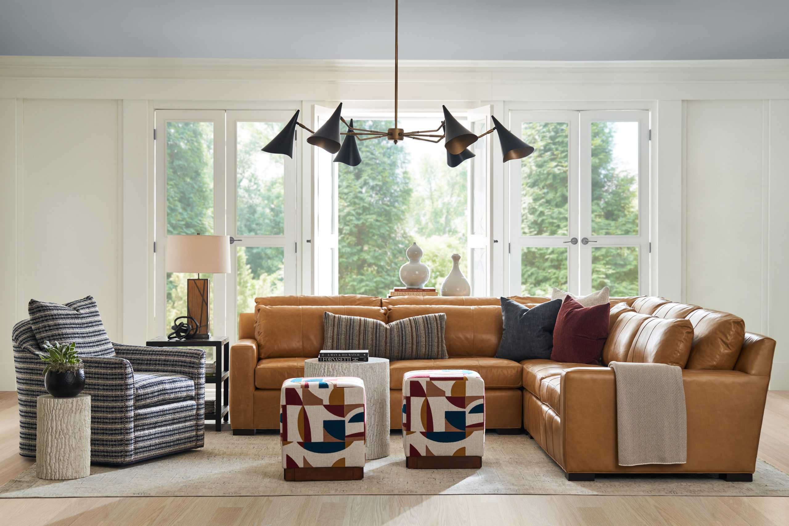
- Racoon Fur 2126-20

It goes without saying that Racoon Fur is one of our favourite moody dark paints. Is it navy? Is it charcoal? Is it black? Is that a hint of purple I see? Who knows, and frankly who cares… the mystery is part of the fun – and also what makes this enigma of a shade so incredibly versatile. We love how white and wood pop against this dramatic backdrop.
You’ll find this colour in two spots: our main room as you enter, as well as our back corridor.


- Simply White OC-17

Ah, Simply White – classic, timeless, and a staple in a decorator’s arsenal of whites. This particular shade has slight yellow undertones but a high LRV (light reflective value), making it a warm white that is still very much a true white, and doesn’t look dirty. Simply White is perfect for rooms with a northern or eastern exposure, or any space that doesn’t receive a lot of natural light, where white can sometimes feel cold and clinical.
You can find Simply White in our east wing and Design Studio (Carriage House building).


- Peale Green HC-121

It’s pretty evident when you walk in our door that we are green lovers. This rich and cozy shade leans ever so slightly warm without veering into olive or moss territory, and creates a beautiful backdrop for gold or brass accents. Fun fact: Alex has this green in her bathroom at home!
You can find this shade in the “nook” of our east wing.


- Secret Path CSP -800 & Chimichurri CSP-810

Yes, another green room – this time a pairing of cool toned sage (Secret Garden) and dark forest (Chimichurri.) This combination of shades was chosen to compliment the deep Racoon Fur in the adjacent area and bright a sense of weight to the space. The room doesn’t get much natural light, so we decided to lean into the moody atmosphere and go with these dusky shades. There was an existing chair rail which we chose to highlight with contrasting colours from the same collection.
This combo can be found in our middle room – behind the front desk.


- Horizon Grey 2141-50

Horizon Grey is a soft and muted shade with a hint of sage (if you’re counting, this is #4 for green paint colours), this shade is extremely easy to work with as a neutral with a little kick. It never comes across as austere or cold, and makes for a wonderful backdrop for warm, earth toned furniture and decor. You’ll notice how it takes on a totally different personality behind the green vs. the beige sofas.
You can find this colour in the west wing of the showroom.


- Pistachio Ice Cream CSP-815

With the main level of our showroom leaning a bit more into the realm of moody and jewel toned, we wanted the second floor to offer a lighter and airer experience without going neutral on the walls. We took inspiration from the muted but cheerful palette of charming English country homes, and chose the sprightly but subdued Pistachio Ice Cream. At first glance you might mistake it for a neutral, but it has oodles of character. If you haven’t been convinced yet of the powers of a green wall… we aren’t sure what else we can say!
You can find this green in the main room of our second level (just up the spiral staircase.)


- Tissue Pink 1163

As a refreshing contrast to the adjacent room’s pistachio hue, we chose Tissue Pink – a soft, happy blush toned pink that Peggy has loved for years. This shade is known to be very calming and actually casts a flattering glow on skin, which is always a bonus. Renowned American designer Thomas O’Brien is a notable fan of this colour. Depending on the light and whatever colour palette is going on in the space, this paint can actually read very neutral.
You’ll spot this colour in the west room of our second floor (fun fact: this was actually Peggy and her sisters’ bedroom for a period of time in the 60s!)


If you’re struggling to choose the right paint colour for your space – or perhaps have made some mistakes in the past – we offer an in-home paint consultation service. One of our team of colour experts will take the guesswork out of selecting the colour and sheen levels for walls, trims, doors, cabinetry… the list goes on.